LOGO制作中的字体设计实例一
1、在选择一款字体并略微拉伸下,比较细长、略有时尚感。
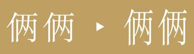
2、然后在此基础上根据整体字体的比例再把下面的部分去除,且略做调整,字体间距上更紧凑。

3、考虑到“俩俩”名称,在字体的衔接处理上加入手牵手的元素理念,使之成为整体。亦能符合“俩俩”成双成对手牵手的景象。

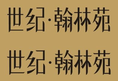
LOGO制作中的字体设计实例二:
效果预览

1、选择一款参考字体,首先了解下字体的特色,该字体横笔划细,竖笔划较粗,笔锋处尖锐。
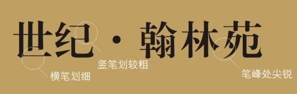
根据字体特色确定横、竖笔划的粗细,在此我设计横笔划的粗细是竖的2倍。然后以方框的形式去统一字体的大小,最后拼出字体。这个阶段必须要花大量时间去构思安排字体笔划。
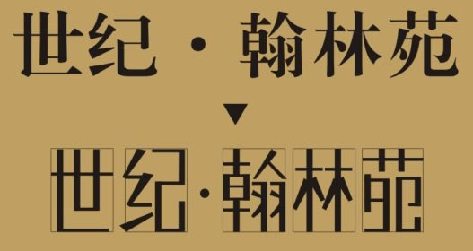
2、此阶段设计的字体会比较生硬呆板,在此基础上结合参考字体特色再做细化的调整,主要是针对笔锋的处理,使字体不至于生硬,且能增强字体的个性特色。
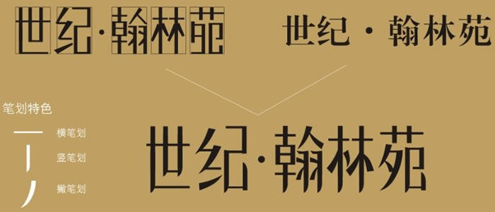
3、此阶段个人在横笔划上也略做笔锋处理,当然此阶段处理方式上可以多样化。
全部评论